ShopDreamUp AI ArtDreamUp

Deviation Actions


armorblueboredombuenocolorcorruptedcrazycreepycrowncthulhucursedcyborgdamseldemondiosdivinedoncelladrawingeffectevileyefliyinggirlgirlsgodgoldengoodgrayheartinspiredladiesladylightslocolovecraftmaidmaidenmalignantmalignomalomalvadometalmythosrobotsacrificesacrificiosoulspookytangletentacletentaclesveinvictimvictimawatercolorwingsaterradorvíctimabadjocensitasciencefictionscifiscififantasyscifisciencefiction
Description
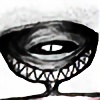
Eyes, eyes everywhere!  This creature is based in my favorite mythogolgy the lovecraftian
  But instead to draw on of the Great Old Ones (I already have a lot in chibi and in macabre here), I decided to create my own. In this case is a former god who was cursed by his own believers because he never listened anybody but used to demand virgins and eat their souls and will slowly... lefting entire nations without young women.
What you think about this new creature?
comments, critiques, faves and sharings are well received (Smile)")
Ojos, ojos por doquier! Esta criatura está basada en mi mitología favorita: La lovecraftiana Pero en lugar de dibujar primigenios (que ya tengo muchos en chibi y macabro en la galería), decidí crear uno propio. En este caso es un otrora dios que fue maldecido por sus propios seguidores debido a que nunca escuchó a nadie y sólo exigía vírgenes en sacrificio, dejando a veces países enteros sin una sola mujer joven.
Qué opinas de este personaje?
Comentarios, críticas, faves y sharings son bien recibidos
What you think about this new creature?
comments, critiques, faves and sharings are well received
Ojos, ojos por doquier!
Qué opinas de este personaje?
Comentarios, críticas, faves y sharings son bien recibidos
Image size
8100x6504px 6.09 MB
Comments24
Join the community to add your comment. Already a deviant? Log In
I like what you've got here. It embodies what human minds could imagine as a result of boredom. I especially like the sketchy look of it.
I think you've accurately titled this as a "cursed god", I could definitely imagine this as a conflict, or an antagonist of some sort.
I could say that I don't see this kind of idea very often. The way you put it is quite interesting. I like how you really push the details, by adding things such as a crown, and robotic parts.
However, there are a few things that I think could have been done better:
- I think that the splatter of black on the right side overpowers the left, I think that you could either embrace that by curving it downward slightly, almost like it were an arm, or you could make the drawing symmetrical.
- Perhaps you could expand on the upper piece of metal, I think that it lacks depth, and could be reworked to look more intricate.
Other than that, I think that your piece looks great, and I would like to see you push your work beyond your borders! Well done!